
Understanding RGB vs. CMYK in the Context of DTF Printing for Accurate Color Reproduction

Your screen and your printer don’t have the same color language, and when you’re designing for DTF printing, that matters.
If you do not understand how RGB vs. CMYK works in the world of DTF printing, you might end up with results that miss the mark.
In this article, we are breaking it all down, you can confidently design with color modes that work with you, not against you.
What RGB and CMYK Actually Mean
Before we get into how they affect your DTF prints, let’s clear the basics of RGB vs. CMYK.
RGB: The Color Language of Screens
RGB stands for Red, Green, and Blue.
These are the three colors that digital screens use to create every shade you see.
Your phone, your tablet,and your computer monitor, all use RGB to light up pixels and form vibrant, glowing images.
It works by adding light.
The more light, the brighter and more saturated the colors look.
If you design something using RGB, chances are it will look punchy and intense on your screen.
But it is made for backlit displays, not ink.
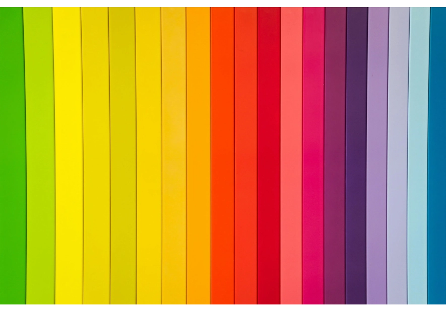
CMYK: The Language of Ink and Paper
CMYK stands for Cyan, Magenta, Yellow, and Key (Black).
This is how printers layer ink to create full-color prints.
Instead of light, CMYK works by subtracting light from white paper.
So while RGB is additive and bright, CMYK is subtractive and grounded in the real-world limitations of pigment and material.
So when you’re working with DTF printing, your file will eventually be converted to CMYK, whether you prep it that way or not.
Why This Matters for DTF Printing
Now here’s where RGB vs. CMYK really makes a difference.
Color Gamut
Color gamut is basically the range of colors that a device or color system can display or reproduce.
When you’re designing in RGB, you’re seeing a digital version that can display colors your printer can’t physically produce.
Colors like electric blues and neon greens might look amazing on screen, but when you go to print them, especially through DTF, the output might fall flat.
That is because CMYK just does not have the same range.
DTF Printers Work in CMYK
DTF direct-to-film) printers rely on CMYK inks to build up the image layer by layer before it is heat-transferred.
This means anything you design in RGB will eventually be translated into CMYK.
And if you don’t do it carefully, that translation might not go well.
You could end up with murky shadows, off-tone reds, or skin tones that just look wrong.
So understanding RGB vs. CMYK is not just about being picky.
It is about making sure your colors survive the process.
How to Design for the Best Color Accuracy
While you might think that you have to give up bold colors, all you need to do is work smarter.
Work with CMYK from the Beginning
If your final goal is a printed DTF transfer, it is best to design directly in CMYK mode from the start.
Most design programs like Adobe Illustrator, Photoshop, and even Canva Pro let you set the color mode of your document.
By doing this, you’ll get a more realistic preview of what your final result will look like.
Use CMYK Color Swatches or Libraries
Many programs come with CMYK-specific color guides.
These swatches give you a better sense of what’s actually printable.
It also helps to test your key brand or product colors in both modes, so you know how they’ll behave.
Soft Proof Your Colors
“Soft proofing” is just a fancy way of saying: simulate what the printed version will look like, right inside your design software.
It helps you spot where colors might shift during the RGB to CMYK conversion, and you can tweak things early on to prevent mismatches.
Common RGB vs. CMYK Mistakes People Make
It happens to the best of us, especially when you’re new to printing, DTF transfers, or understanding RGB vs CMYK.
Here are a few common pitfalls, and how to avoid them.
Mistake 1: Designing Entirely in RGB and Converting at the End
This is super common.
You spend hours perfecting a bright, crisp design in RGB.
Then you convert it to CMYK at the end, and half your colors dull down.
It feels like all that work gets undone.
Instead, try starting in CMYK, or at least check your colors as you go.
Mistake 2: Ignoring Soft Colors and Skin Tones
CMYK is great for many things, but delicate shades, like pastel pinks, beiges, and skin tones, can get muddy if not handled carefully.
Always test how these colors shift when switching modes.
Mistake 3: Overusing Bright Colors
We all love a good neon moment, but CMYK printers (and especially DTF printers) are not built for ultra-bright digital shades.
If you want vibrancy, stick to CMYK-safe bolds, or talk to your print provider about options like spot colors or fluorescent ink alternatives, if available.
Should You Always Design in CMYK?
This is a common question, and like most things in design, it depends.
When to Stick with RGB
If you’re creating designs for digital use only like mockups for a website or social media previews, RGB is perfect.
It’s faster, gives you more color flexibility, and your screen is built to show RGB anyway.
Also, if you’re still playing around with ideas and haven’t committed to print yet, RGB lets you explore a wider range of colors.
Just remember you’ll need to convert later.
When to Switch to CMYK
As soon as you know your design is going to be printed using DTF, you’ll want to either switch to CMYK or regularly check your design in CMYK preview mode.
This is especially important for things like:
- - Product labels
- - Apparel graphics
- - Transfers for client orders
- - Any commercial DTF work where color accuracy matters
Making this change early can save you from major headaches and reprints later.
How RGB vs. CMYK Impacts Your Workflow
Understanding the RGB vs. CMYK difference doesn’t just help your final result.
It also changes how you plan, communicate, and prepare for print.
Communication with Your Printer
Whether you’re handling printing yourself or sending your files to a provider, knowing the difference helps you speak the same language.
Instead of just sending an RGB file and hoping for the best, you can ask the right questions:
“Do you recommend converting to CMYK before sending?”
“Can you soft-proof this before printing?”
“Are there any colors in my file that might not come through accurately?”
This kind of clarity keeps your projects smooth and professional.
Prepping Files the Right Way
Printers love clean, ready-to-go files. When you design with CMYK in mind, you avoid surprises like:
- - Washed-out colors
- - Unprintable neon shades
- - File rejections due to color mode incompatibility
It’s one of those “small effort, big reward” habits that improve your DTF transfers.
RGB vs. CMYK in DTF Transfers: A Quick Visual Example
Let’s break this down with a basic but helpful comparison of how a single design might look in both color spaces.
| Element | RGB View (On Screen) | CMYK Print Result (DTF Output) | ||
| Bright Orange | Glowing, almost neon | Slightly duller, more pumpkin-like | ||
| Bright Orange | Sharp, radiant, intense | Muted, with a purple-ish cast | ||
| Skin Tones | Warm and lively | Slightly cooler or flatter if unadjusted | ||
| Pastels | Delicate and airy | Can appear dusty or grayish if not optimized |
Final Tips to Nail Your Color Every Time
To get RGB vs. CMYK right, here are a few tips to help you:
- - Know Where Your Design Is Headed: If it’s going to be printed, especially via DT, plan with CMYK in mind from the start.
- - Use Real-World Color References: Have a few favorite shades you rely on? Print a test swatch in CMYK and use that as your benchmark.
- - Always Double Check Before You Hit Send: Do one last conversion check before submitting your file to be printed. That five-minute review can save you from costly do-overs.
Bring Your Colors to Life with DFT Transfers Now
Understanding RGB vs. CMYK is just the beginning.
To ensure your designs translate perfectly from screen to fabric, you need a printing partner who gets it.
At DTF Transfers Now, we specialize in turning your digital visions into vibrant, high-quality DTF transfers.
Our advanced nine-color ORGB process ensures that your prints capture the full spectrum of colors with unmatched accuracy.
Whether you're a small business owner, a designer, or just someone looking to create custom apparel, we've got you covered
With no setup fees, no minimum orders, and same-day printing options, bringing your designs to life has never been easier.
Start your order today and experience the difference with DTF Transfers Now.
Your colors deserve to shine just as you envisioned them.
Leave a comment